


CLEVELAND — From the outset of the COVID-19 pandemic, there has been a consistent pattern in the daily reports of new cases each week from the Ohio Department of Health — the number of new cases reported is lowest on the weekends, and then it seems to steadily rise throughout the week, often peaking on Friday. These are numbers that have been featured prominently in our reporting.
One only has to look at the Current Trends data dashboard to see the evidence of this pattern. Over the last three weeks, the days with the highest number of new cases have been either a Friday or a Thursday: 9,019 new cases on Friday, Sept. 10, 8,447 new cases on Friday, Sept. 17 and 7,475 new cases on Thursday, Sept. 23.

Conversely, the days with the fewest cases reported recently have been either a Sunday or a Monday: 4,463 cases on Sunday, Sept. 12, 4,428 cases on Sunday, Sept. 19, and 3,681 cases on Monday, Sept. 27.
Alicia Shoults, with the Ohio Department of Health’s Office of Public Affairs and Communications, provided News 5 with an explanation for the day-to-day fluctuations in COVID-19 case numbers.
“These variations can happen for a variety of reasons, such as healthcare and testing availability and laboratory reporting time frames,” Shoults said. “Throughout the pandemic, reported counts have consistently been lower on weekends, holidays, and days immediately following periods where such services may be closed."
Conversely, reported cases are higher in the middle and end of the week, as more people have access to medical services during the week, and facilities have had the chance to report their results to ODH.
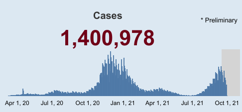
Dr. Pauline Terebuh, an infectious disease specialist who currently works with a preventative medicine group that collaborates with Cuyahoga County, said that one of the key tools that those in her field use is called the “epi curve,” and it’s something she says you’ve probably seen a lot during this pandemic. It is a graph that plots the number of cases over any unit of time, be it hourly, by day, by weeks or years.
A chart created by News 5 partner HiGeorge showing daily COVID-19 cases reported in Cuyahoga County. See more data here.
“Your eye can look at it and see what the trend is,” Terebuh said. “And if you look at what we've been doing for COVID-19, we've been reporting on a daily basis. And what you'll see, which is really common, is you see a 'sawtooth' pattern.”
That is a pattern of small “ups and downs,” such as the trend for cases to be lowest on the weekends and highest in the mid-to-late week.
“But if you step back and you look at the big picture, you can see big waves up, wave down and then back up again,” Terebuh said. “And if that sawtooth pattern is sort of smoothed out, those are really the bigger trends of what's going on in the community."
Shoults said that while the Current Trends page from ODH is based on the day that cases were reported, other metrics shown on its Coronavirus website are based on the date of occurrence, such as the illness onset date for COVID cases, date of hospitalization or date of death.
To further explain how these data are reported differently, Terebuh walked through the complete process of how a complete COVID case is reported to the county and state.
“There’s really a few ways that can happen, but the most common thing is that you get tested for it,” Terebuh said. “And then public health follows up to do a case interview. And it is hopefully possible to talk to you or someone related with your care to find out a little bit more about that, about your illness.”
It is in the course of that case interview that health professionals ask when a person first experienced symptoms, Terebuh said.
“Let’s say, for example, someone got exposed to COVID on Sept, 1, but maybe it wasn't until Sept. 5 that they first noticed that they had a runny nose and a cough,” she said. “And then it may not be for another 10 days that that illness got much worse and they decided they needed to go to the emergency department. So if that person got tested, when they go to the emergency department, let's say on the 15th, when do they end up on that graph? Well, if we find out that their first symptoms were on September 5, we'll put them on September 5.”
But what about people who took a test and tested positive, but didn’t have symptoms or couldn’t say when they first experienced them?
“We don't really know when it started or we can't ascertain when it started,” Terebuh said. “And so we will put them on the date that is first associated with their illness, and oftentimes that's the day of testing. So those trends that you can see day-to-day reflect a number of different things.”
She said one of the things it reflects is when testing is happening.
“It's much more common that people are going to be tested during the week because people may be more likely to seek out testing,” Terebuh said. “They may be required to have testing, for example, if they're going to work and there is some testing protocol in place or testing is offered at doctors’ offices and so forth. And so perhaps if they don't have symptoms, but they need testing, perhaps to travel or something like that, then they'll go during the week. And so those day-to-day trends mean a lot less than the overall trends.”
Shoults said that ODH has devised a way to account for the differences in preliminary data.
“Data will be back-filled to the appropriate date as it is reported to ODH,” Shoults said. “Data that is likely to fluctuate the most (i.e., event that occurred within the previous two weeks) is shown in gray to indicate that the reports for this period are still being received and counts are preliminary. ODH encourages everyone utilizing the dashboard to look at the overall trends for metrics, rather than the inherent daily variations.”
Terebuh also said that it is the overall trends that are most important, and “if you put a lot of stake in the date today, I think you can really not see the forest for the trees.”
She said, for example, if you were looking at traffic data on a highway to determine if it’s getting busier, “if you count the cars on a Monday or you count the cars on a Saturday, or if there happens to be a holiday that week, you may come up with a very different conclusion. So it makes a lot more sense to compare the numbers week to week.”
Terebuh said that local and state health departments often track and report a seven-day average or the average over the previous two weeks.
“That gives you a much better picture of what's going on, because it's a combination of when people get tested and when public health learns about the cases that that can be ascribed to those up and down patterns,” she said.
Key metrics tracked by ODH are county and state averages of cases per 100,000 residents over the past two weeks.
That metric has been steadily rising in Ohio, and has gone from 19.6 cases per 100,000 residents in Ohio on July 1 to 683.3 cases on Sept. 16.
Click the "Play" button below to view an animated map showing the change in cases per 100,000 residents in each Ohio county from July 1 through August.
The current trends make very clear that COVID-19 cases and hospitalizations have been on the rise since early July, Shoults said.
While the overview dashboard on the ODH website may show days where these metrics are higher and days where they are lower, as a whole, “it is on an upward trend – the wrong direction,” she said. “When more Ohioans choose to be vaccinated, they are protected from severe illness and death, and this can help alleviate the pressure currently on our hospital systems.”
Additional Coronavirus information and resources:
Download the News 5 app for free to easily access local coronavirus coverage, and to receive timely and limited news alerts on major COVID-19 developments. Download now on your Apple device here, and your Android device here.
See complete coverage on our Coronavirus Continuing Coverage page.
Vaccinating Ohio - Find the latest news on the COVID-19 vaccines, Ohio's phased vaccination process, a map of vaccination clinics around the state, and links to sign up for a vaccination appointment through Ohio's online portal.
See data visualizations showing the impact of coronavirus in Ohio, including county-by-county maps, charts showing the spread of the disease, and more.
Rebound Northeast Ohio News 5's initiative to help people through the financial impact of the coronavirus by offering one place to go for information on everything available to help and how to access it. We're providing resources on:
Getting Back to Work - Learn about the latest job openings, how to file for benefits and succeed in the job market.
Making Ends Meet - Find help on topics from rent to food to new belt-tightening techniques.
Managing the Stress - Feeling isolated or frustrated? Learn ways to connect with people virtually, get counseling or manage your stress.
Doing What's Right - Keep track of the way people are spending your tax dollars and treating your community.
We're Open! Northeast Ohio is place created by News 5 to open us up to new ways of thinking, new ways of gathering and new ways of supporting each other.
View a map of COVID-19 testing locations here.
Visit Ohio's Coronavirus website for the latest updates from the Ohio Department of Health.
View a global coronavirus tracker with data from Johns Hopkins University.
